

In May 2025, the product design team at Intercom came together for a hackathon in our London office.
Folks flew in from as far afield as Dublin, Barcelona, Amsterdam, Chamonix, and Merseyside. Our org has 30+ product designers sprinkled across the UK and Europe, so it’s always special to meet up in person.
Our mission: build an Intercom-related feature, product, webpage, or experience using nothing but AI. We could experiment with any number of tools, like Lovable, Windsurf, Replit, or Cursor. The goal was to choose a project, choose an AI tool, and build something usable – fast.
Our team brief, built with AI, set the tone for the hackathon.
I teamed up with Daria Vorontsova and Tanya Ermolaeva. We wanted to build a new website for “Intercom Design” – a single space for all things design at Intercom, where our team could share case studies, inspirations, and thought leadership with the world. This was the perfect opportunity to start vibe coding and see where it took us.
In the end, we were able to spin up an initial version of the Intercom Design website in just over a day, and set it live shortly after. Here’s a look at our process and what we learned along the way.
From nothing to something: The AI “ah-ha!” moment
We wanted our site to be a metaphor for the messy canvas that design teams often operate in. Inspired by portfolios from Alec Babala and Yeji Seo, and collaborative tools like FigJam, we decided to build a “desktop collage” experience that encouraged people to roam around and explore our content.
We jumped straight into Lovable and spent time crafting a long, detailed prompt. We were hoping to “one-shot” our creation – in other words, get the bulk of our prompting right the first time, then refine it bit by bit. Our master prompt was two pages long.
We dropped it into Lovable, sat back, and waited.
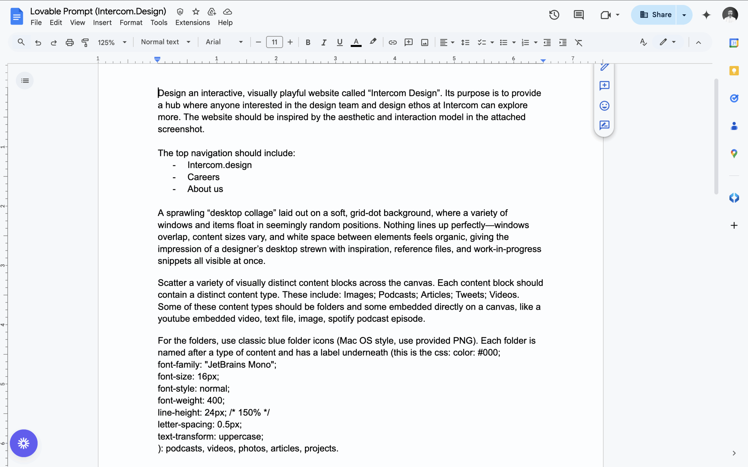
Our prompt for Lovable was deep and detailed (or so we thought).
Eventually, Lovable returned its result: a simple canvas-style website containing a collection of content blocks. This was too good to be true. From nothing to something, just like that!
When AI’s confidence outpaces its capabilities
But then we realised the blocks on the canvas weren’t draggable, even though our prompt had specified this. And the canvas wasn’t scrollable – something else our prompt had specified. Everything was static and locked in place, so we asked Lovable to fix these problems.
Soon, we were confidently informed: “All content blocks can now be dragged and the website is fully scrollable.” But neither of these things were true. And, as it turned out, no amount of re-prompting could guide the LLM to fix this.
Updating scrolling and dragging rules seemed like small tweaks in the grand scheme of things, yet every time we asked for these updates, Lovable would rewrite huge chunks of code. In doing so, it would alter other areas of the site we didn’t want to change.
We began to realise that unique interactions – like endless scrolling on a canvas – are not what an LLM “expects” a website to do. Lovable would try to execute our prompts, but something would always be off: the scroll speed would be wrong, the canvas borders would be incorrect, objects would be too big or too small.
The technical behavior we desired was challenging to capture in a prompt, without getting help from an engineer. We realized that MCPs were probably the best way to reach our desired UI, but by that point we were running out of time.
Done beats perfect: Calling it at MVP
We agreed to draw a line in the sand and step away from our laptops. The website didn’t work perfectly and it didn’t look beautiful. But, as an MVP, it was done and it existed. We’d built a basic site in a handful of hours and had something real to share with the hackathon crew.
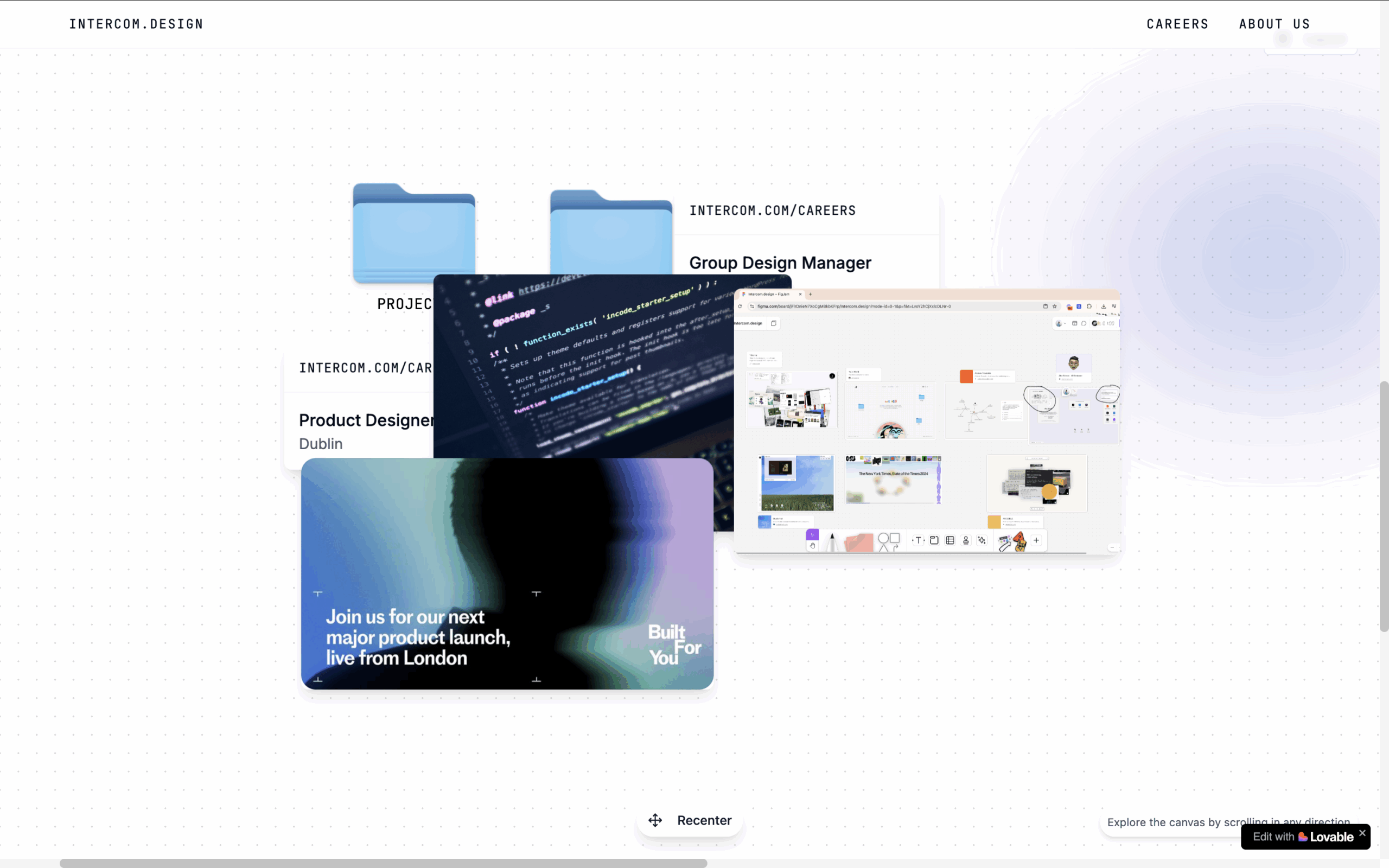
Four hours in Lovable gave us something messy – but it worked.
To close the day, all product designers reconvened to show off their creations. When we all voted for our favourite ideas, the Intercom Design website came out on top.
Our thoughts: Yay, we got first place! Oh no, now we have to actually launch it!
Over the next two weeks, in small focused bursts, Daria, Tanya, and I continued refining our prototype.
First, we decided to switch tools. Lovable had got us this far, but now we made a conscious switch to Cursor. There was no way to migrate from Lovable, so we built our site again from scratch. This was time-consuming but once it was done, things felt faster by comparison.
In Lovable, we’d been using libraries in React, but our site didn’t need ready-made components like toggles or cards. Cursor gave us Vanilla JS instead, with no need for external libraries or frameworks. This helped us move quicker.
Second, we kept refining the design. Piece by piece we made improvements:
- Defined a successful scrolling method
- Sharpened our layout and UI
- Added an interactive minimap
- Added on-hover animations
- Added dark mode
Before long it was all adding up. What was left? Oh yeah, the actual content.
How we structured content for launch
No design will succeed without meaningful content, of course. So we got granular with a content plan. How did we want to group items together? How many content items did we want per group? Did we have enough recent content available, so the site would feel timely and fresh?
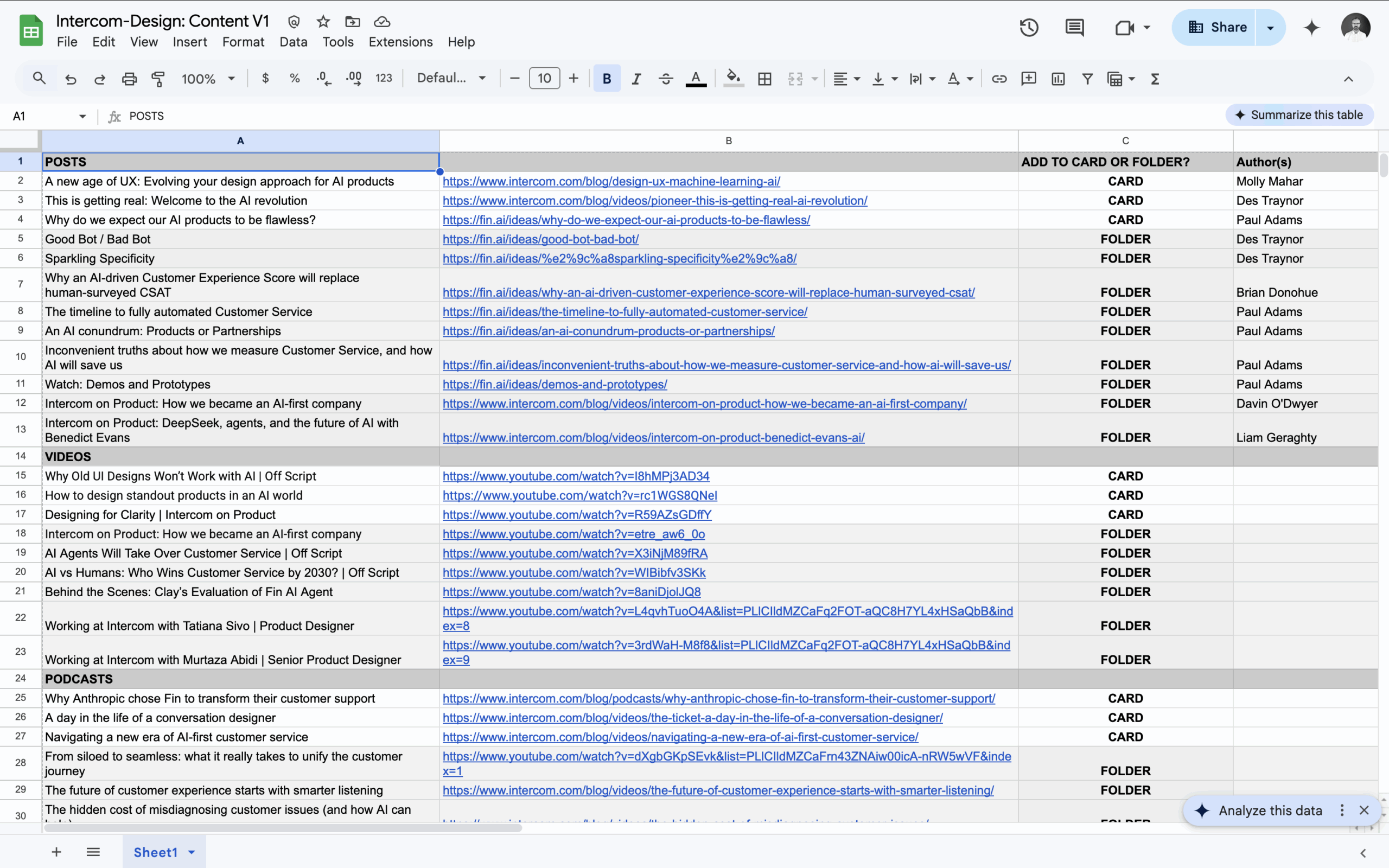
A quick content plan helped us structure our site.
Ultimately, we would need a CMS integration to maintain the content over time, but we decided to keep things simple for launch. We would ship a defined list of content, see how it performed, then scope our CMS needs accordingly.
To get the site live all we really needed was folders for content types, including articles, videos, and podcasts, and cards for free-floating content, like quotes, social posts, and images.
Thinking beyond the launch, we realized we’d need to put a content pipeline in place to keep our insights up-to-date and give every designer at Intercom a voice.
We have new material coming up from the Intercom design team, including new podcasts and interviews – so watch this space.
Going live with the new website
The revamped Intercom Design hub is now live, offering an inside view for anyone interested in design at Intercom. All it took was three designers and two AI tools. We did it on our own, at speed, with almost no help from engineering. And that’s something we’re really proud of.
We hope you check it out.
The new Intercom Design site: made by three designers and two AI tools, in (almost) one day.
